Purpose: Academic Project
Goal: Design an online grocery shopping system that supports budgeting functionality and facilitates engaging shopping based on recipes provided by Save-on-Foods
Time: 2 months
Role: user researcher, prototyping, UI/UX designer
Tools: Figma, pen & paper, sticky notes, usability studies
What did I gain from this project: Experience employing a 4-stage design process in an iterative team project

Understand problem based on expected user needs:
Explore problem space and contexts of use:
Confirm chosen design approach and identify major uncertainties related to new design elements:
Final Delivery integrating improved design elements:

.png)
- conduct Usability Studies
- develop Conceptual Models
- create Low Fidelity Prototypes
- run Cognitive Walkthroughs
- create Medium Fidelity Prototypes
- conduct User Testing
Who
This redesign of the Save-on-Foods website is based around the users we identified in our early usability studies. These users expressed some frustration around the lack of affordance on the existing online shopping interface. We studied individuals who were not regular Save-on-Foods customers but had experience using similar e-commerce type interfaces.
Why
We ran user tests to evaluate user performance on the original Save-on-Foods interface. Think-aloud observation and interviews revealed the following findings:
1. Users find that the current browsing functionality (browse by category) lacks flexibility. They wished there were additional ways to peruse products.
2. Browsing for groceries online was not as engaging for users as shopping in person.
3. Users were concerned about spending more money on the online interface than they would online
These findings indicate that users desire functionality that promotes exploration and engagement. We determined that browsing products by recipe could provide customers with a more satisfying and enjoyable online shopping experience. Additionally, a system that supports budgeting functionality might remedy user concerns of overspending.
What
The interface we designed enables users to browse recipes and add ingredients from the recipe directly to their cart. To promote flexibility users can choose to add the default brands/varieties of ingredients to their cart or they can modify the products based on personal preference. To allow users to shop within their respective budgets we introduced a widget where users input the amount they want to spend. When the cart subtotal is nearing the budget, the user is notified
We generated the evaluation goals in order to assess the learnability of the new functionality that we introduced to the SaveOnFoods online shopping website. The evaluation goals encompass both of the new functions: adding products from a recipe to the cart and budgeting.
1. Do users understand how to set and modify a budget, and are they aware when they exceed their budget?
2. Do users understand how to add the default products and a modified list of products from a recipe to their cart?
3. Overall, do users feel satisfied with their interaction with the interface. If not, which aspects or functions caused dissatisfaction?
We used these evaluation goals to drive our next iteration. We conducted task-centered usability studies on the following medium-fidelity prototype


USERS CAN SHOP FOR INDIVIDUAL PRODUCTS BY CATEGORY
USERS CAN BROWSE THROUGH FEATURED PRODUCTS AND WEEKLY DEALS
WHEN RECIPE PRODUCTS ARE ADDED TO CART, THE SUBTOTAL IS UPDATED
USERS ARE NOTIFIED WHEN THEY EXCEED THEIR PERSONALIZED BUDGET
USER SELECTS A RECIPE
01 Browse Recipes
02 Recipe Page
INGREDIENTS CORRESPONDS TO ACTUAL PRODUCTS IN THE SAVE-ON-FOODS INVENTORY
03 Customize products
DEFAULT PRODUCTS FOR EACH INGREDIENT ARE LISTED
USER CAN SELECT THEIR PREFERRED BRAND FOR EACH INGREDIENT
USERS BROWSE RECIPES BY NAME, OR CAN APPLY FILTERS TO BROWSE RECIPES BY CUISINE, MEAL TYPE, PREP TIME, DIETARY RESTRICTIONS, ETC
THE DEFAULT LIST IS UPDATED BASED ON USER'S PREFERENCES
MODIFY THE QUANTITY OF PRODUCT OR REMOVE IT ENTIRELY
04 Browse alternatives

THE CUSTOMIZED LIST OF PRODUCTS IS ADDED TO USER'S CART
How

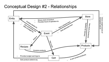
We developed two conceptual models which captured the key objects, attributes, and operations that we wanted our interface to support

.jpg)
.jpg)

We brainstormed prototyping questions, and identified those which capture our conceptual model best
-
What is the best way to add ingredients to the cart from a recipe?
-
How do we account for ingredient quantities when adding to the cart?
-
How do we compare the subtotal with the user’s current budget? Warning, limit?
-
How do we suggest products that relate to the ingredient?
-
When choosing which product a user wants to add for a recipe, how many options do they get to choose from?
-
How does the user input their budget? Slider? Input box?
-
When you exceed budget what happens? Option to increase?
-
How can we allow the user to change the serving size?
-
Can you choose bulk ingredients? What is the default?
-
How can a recipe include a cost estimate?
-
What is the best way for users to browse recipes?
-
How can filters best be used to filter recipes when browsing?
-
How can allergens best be displayed?

We built a lo-fi paper prototype in order to address the highest priority questions
01 Early Design - Paper Prototype

We developed evaluation goals for our usability studies, and ran user tests (think-aloud observation and interview) on recruited participants
-
Do users understand how to set and modify a budget, and are they aware when they exceed their budget?
-
Do users understand how to add the default products and a modified list of products from a recipe to their cart?
-
Overall, do users feel satisfied with their interaction with the interface. If not, which aspects or functions caused dissatisfaction?

We built our medium-fidelity prototype in Figma, which was based on the feedback received on cognitive walkthroughs of the paper prototype
02 Mid Design - Medium Fidelity Prototype

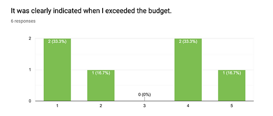
We analyzed the data obtained from our usability studies and identified the following key findings:
.png)
03 Data Analysis - Affinity Diagram
.png)
.png)
04 Data Analysis - Example of quantitative data
Moving Forward
Future iterations of this design project might involve addressing the findings obtained from our usability studies. It is evident that the budget widget should provide more feedback to users. Additionally, vocabulary used in our interface could be clarified in order to prevent ambiguity for our users.
Team
UX Design
Courtney Young, Ella Wilson, Li Ze Choo, Andy Kim, Katherina Shen